
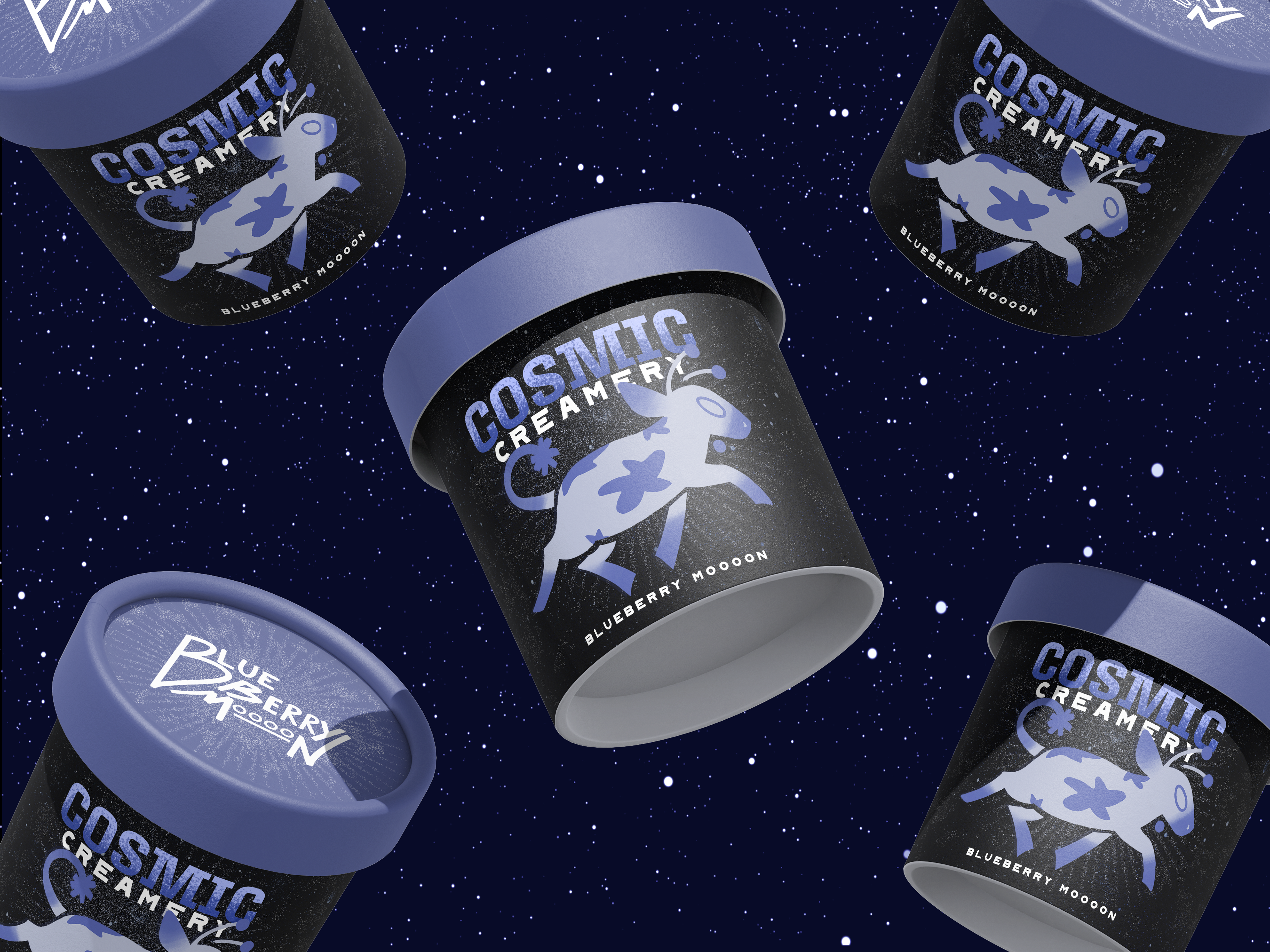
My not-so-secret hobby is researching unique marketing and business strategies, and I’ve spent years admiring Ben & Jerry’s commitment to community-driven values. Inspired by their model, I developed a branding system for a theoretical space-themed ice cream company centered on environmental sustainability—tailored specifically for a younger, whimsically minded audience.
𓆟
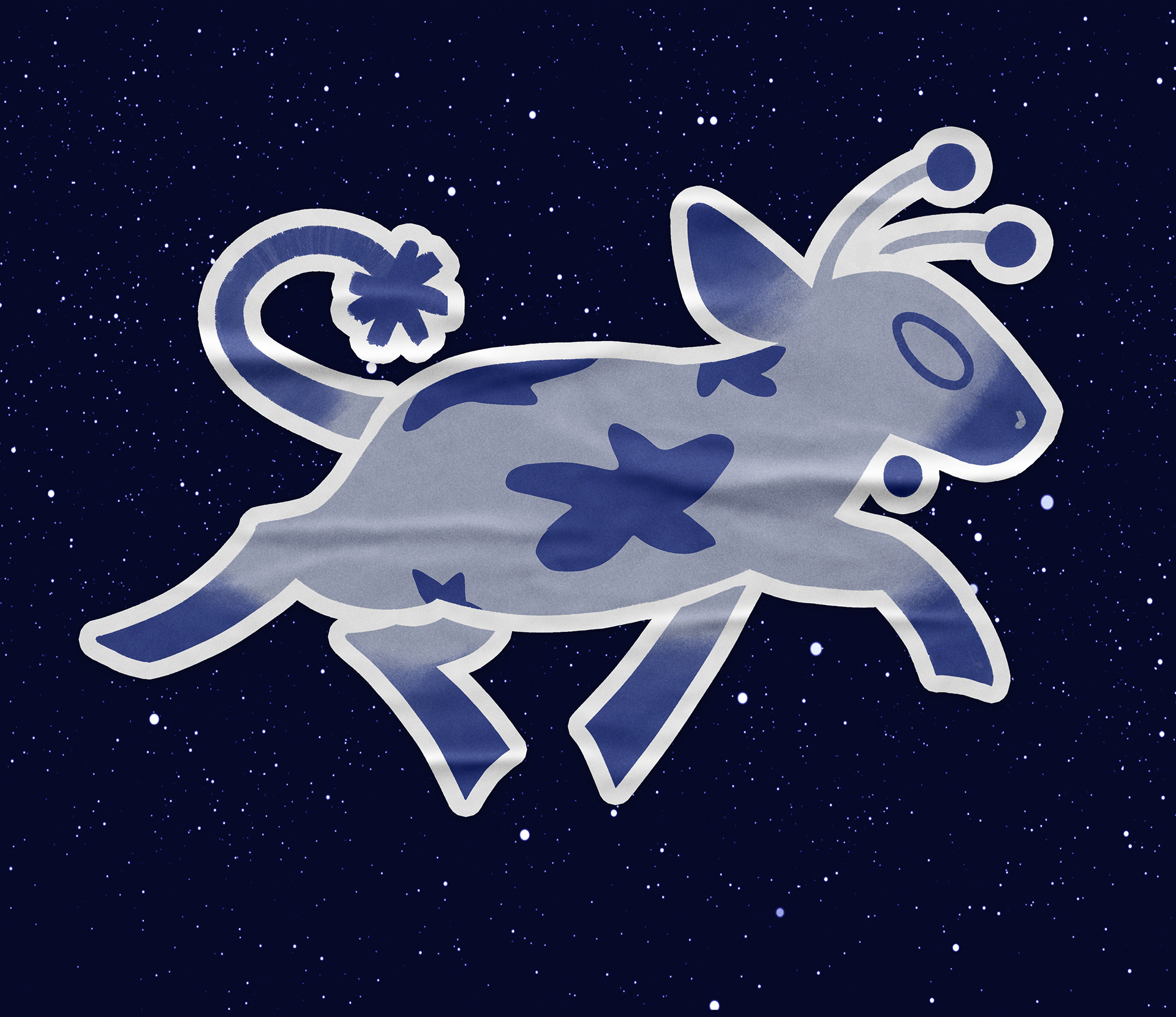
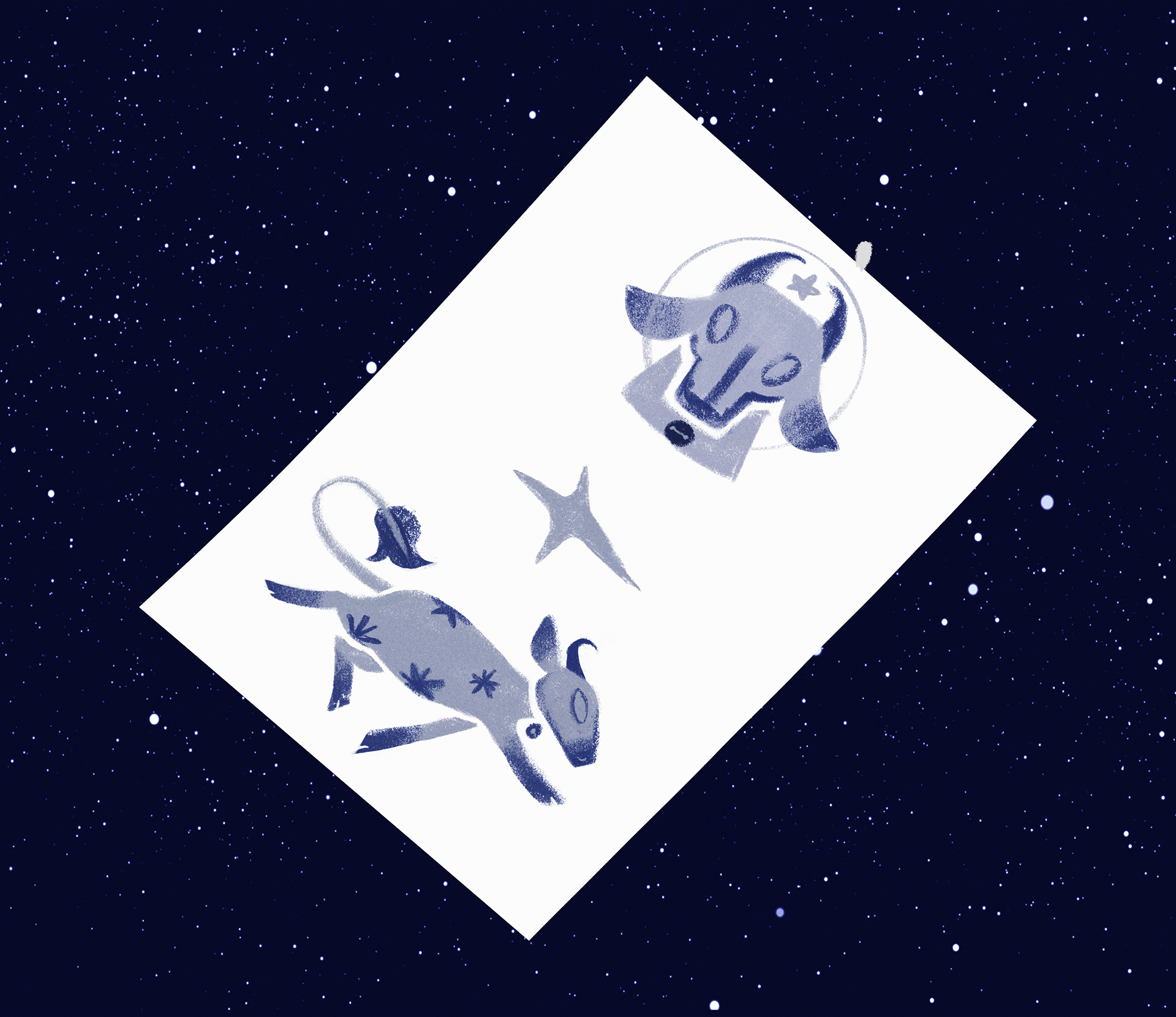
I began by designing the brand mascot, Milky Way: an adorable alien cow designed for strong visual identity, seamless scalability, and color variations across different flavor lines. For the packaging, I gave the cups a deep space wrap and paired it with organic, hand-drawn typographic elements. This subtle contrast keeps the brand feeling "down to earth," reinforcing its eco-friendly mission. To top off the packaging design, I modeled the lid after the textured surface of the moon, seamlessly tying the outer space concept together from top to bottom.